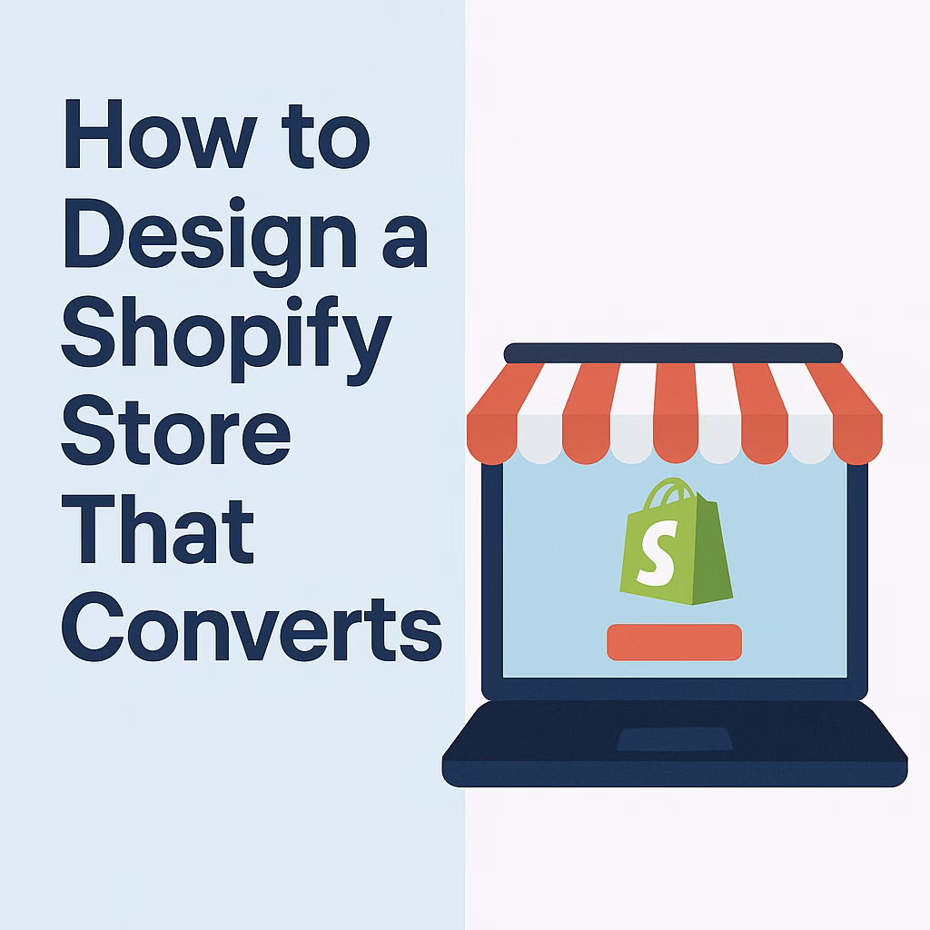
Your store might look “good” — but is it making sales?
Design isn’t just about beauty. It’s about function, speed, and flow. A messy or outdated Shopify design can kill trust, confuse buyers, and cost you sales.
In this post, we’ll break down the key elements of a high-converting Shopify redesign, based on what we’ve done for dozens of our clients.
🧠 Step 1: Simplify the Homepage
Your homepage should answer 3 quick questions:
- What do you sell?
- Who is it for?
- Why should I trust you?
Fix this by:
✅ Clear headline at the top (e.g., “Natural Skincare for Sensitive Skin”)
✅ Hero image or banner with a single product or offer
✅ 3 simple navigation links: Shop, About, Contact
✅ Add 1 strong call-to-action (Shop Now / Browse Products)
🛍 Step 2: Focus on Product Pages
Product pages are where conversions happen — not your homepage.
Here’s what every product page must have:
✅ Clear product title with keyword (e.g., “Men’s Slim Fit Cargo Joggers”)
✅ High-quality photos (at least 3 angles, lifestyle if possible)
✅ Short bullet points + full description
✅ Price, shipping info, and return policy
✅ “Add to Cart” button above the fold
✅ Real reviews and FAQs
📲 Step 3: Make It Mobile-First
More than 70% of Shopify traffic is mobile — but many stores are only tested on desktop.
Fix this by:
✅ Using a responsive theme like Dawn or Refresh
✅ Removing popups that cover the screen
✅ Making sure buttons are big, clickable, and not too close
✅ Checking that checkout works smoothly on mobile
🚀 Step 4: Add Trust & Social Proof
People buy from people — not logos.
Make sure to include:
✅ Testimonials or star reviews
✅ Trust badges (Secure checkout, Payment methods)
✅ Real photos from customers or influencers
✅ “As seen on” or brand collaboration logos (if available)
⚡ Step 5: Boost Speed & Remove Distractions
A slow or cluttered store turns people away fast.
Fix this by:
✅ Compressing all images with TinyPNG
✅ Removing unused Shopify apps
✅ Using simple, clean layouts
✅ Avoiding autoplay videos or heavy sliders
💼 Real Example: How We Helped One Store Double Their Conversion Rate
We recently redesigned a Shopify store in the fashion niche. Here’s what we did:
- Switched to a lightweight theme (Dawn)
- Added bold product photos and new descriptions
- Installed a reviews app and simplified checkout
Result?
Conversion rate went from 1.2% to 3.9% within 2 weeks.
Sales doubled — without running more ads.
👇 Final Thought: Don’t Just Redesign, Rethink
Redesigning your store isn’t about being fancy — it’s about being clear, fast, and persuasive.
Every change you make should answer this question:
“Will this help the customer buy with more confidence?”
If not, leave it out.
✅ Need a Store Redesign That Converts?
We’ve redesigned over 50 Shopify stores — helping our clients turn window shoppers into real buyers.
👉 Click here to request your Free Shopify Store Audit
We’ll give you clear design suggestions, SEO tips, and product insights to help your store sell better.